Healthcare Performance Analytics Dashboard
Replacing outdated static reports with real-time insights,
empowering hospitals to make smarter decisions
Project Overview
Healthcare leaders relied on a static PDF report and analyst support to understand complex hospital data.
I led UX design for an interactive analytics dashboard with an experimental AI chatbot, enabling users explore data, understand trends, and make decisions independently.
The Problem
The existing CDB Q&A report was a downloadable PDF. While comprehensive, it was:
Difficult to interpret without expert guidance
Static and limited to annual snapshots
Lacking interactivity or exploratory capabilities
Hospitals depended heavily on Vizient analysts to explain results, slowing decision-making and limiting self-service. Users needed:
Real-time access to performance data
Clear, intuitive visualizations for non-technical audiences
Tools to explore trends, identify opportunities, and model future scenarios.
Role
Sr. UX Designer & Researcher
Tools
Figma
Miro
Zoom
Teams
Duration
On-Going (2023-current)
Discovery & Research
Competitive Analysis
I researched emerging AI-powered reporting tools to understand how they were using AI with data visualization. Some relied entirely on chat-based interactions, while others combined AI with familiar filtering and exploration patterns.
These insights informed a mood board capturing effective interaction patterns, visual approaches that reduced cognitive load, and opportunities to improve clarity over traditional tools
Ideation
User Flows
I developed a user flow to explore and discuss the requirements and intent of each page.
Personas
When we first started the project, our primary focus was enabling the chat to deliver role-specific insights—whether the user was a nurse, COO, or data analyst—by leveraging a single dataset or combining multiple complex Vizient data sources.
Mid-Fidelity Wireframes
I created low fidelity wireframes to validate concepts early, align stakeholders, and communicate complex functionality clearly before building detailed flows.

Scope Shift & Summit 2024
Leadership Changes
Midway through the first year of the project, leadership changes split the work into two parallel tracks - the AI Chatbot and Q&A Dashboard - with a hard deadline to demo at Summit 2024.
Early User Validation
During this period, I presented a clickable prototype to a steering committee of 20 hospital users for early feedback. While formal usability testing wasn’t the focus, feedback was overwhelmingly positive, particularly for the year-to-date scorecards and prediction tools, validating our direction.
Summit 2024 Demo
The Vizient Connections Summit is the company’s flagship annual event. I partnered with marketing to create polished wireframes for executive presentations and built a clickable prototype for the demo room. The Q&A dashboard was functional, though the AI chatbot wasn’t yet operational.
Users experienced a guided walkthrough, then explored hands-on. The engagement was high with particular excitement around the interactive dashboards and projection tools that replaced static reporting.
Pilot Program & User Feedback
Beginning in 2025, we rolled out the dashboard to a group of pilot hospitals and health systems to validate real-world usage. Each organization followed a structured process: live walkthrough training, a month of independent testing, and follow-up interviews. These evolved into bi-weekly feedback meetings for on-going insights.
Key Findings
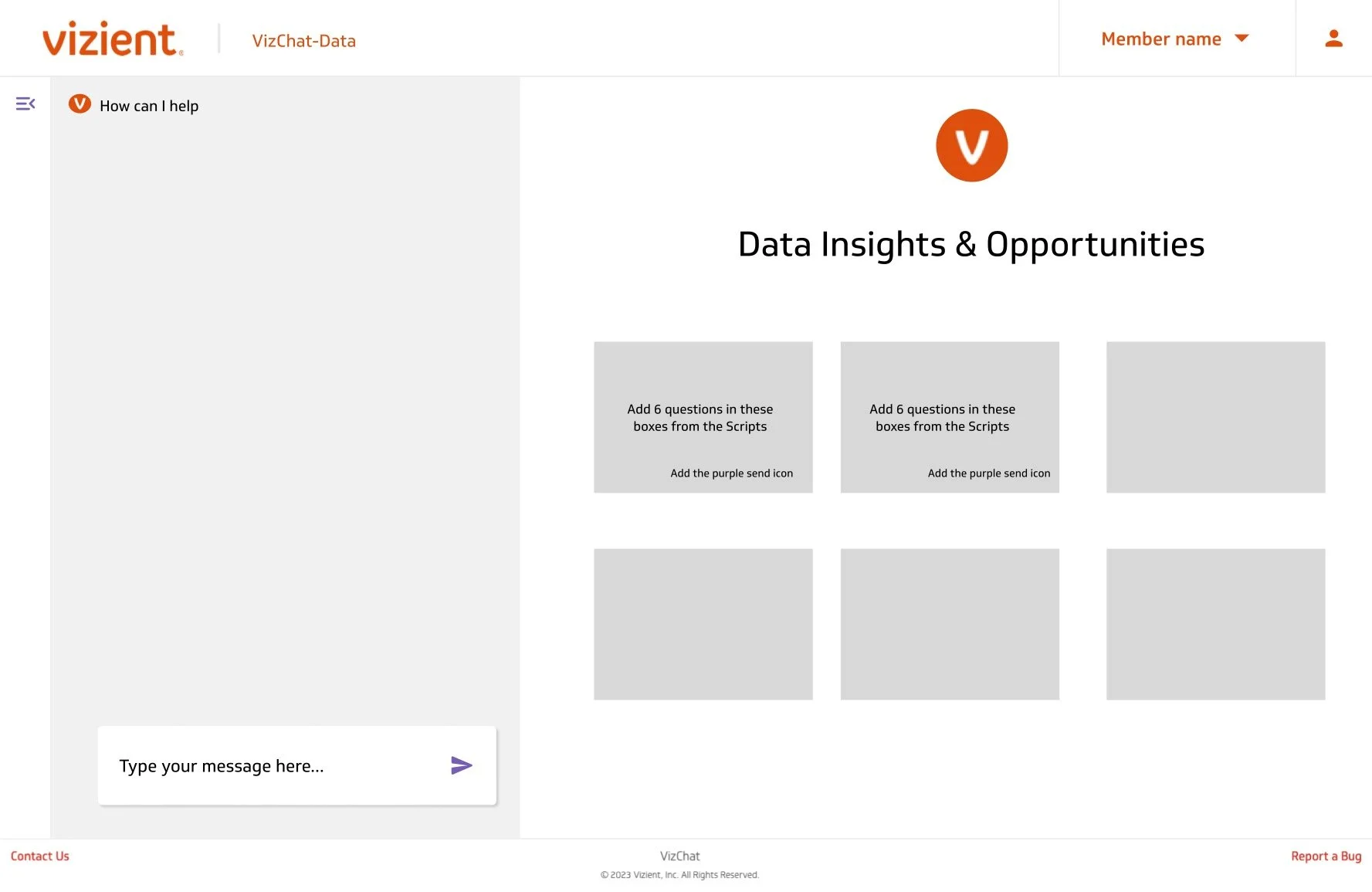
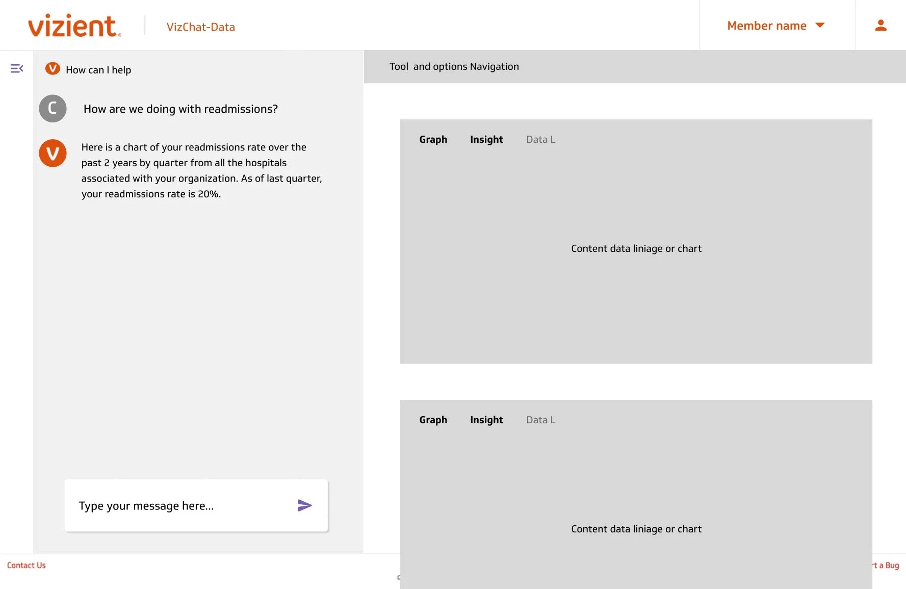
AI Chatbot Failed to Deliver
Unable to reliably answer user questions with accuracy
Users quickly abandoned it out of frustration
Confirmed that AI must add real value, not novelty
Usability Improvements Needed
Some users struggled to locate key actions and navigate between sections
Needed to be more explicit and guided for non-technical users
Feature Requests:
Historical significance chart to understand performance over time
Clear indicators showings when data has been updated
Additional data visualizations that were initially removed to streamline scope
Iteration & Final Solution
Key Decisions & Improvements
Removed AI Chatbot entirely after failing to meet user needs and trust standards
Addressed all identified usability issues through navigation and layout updates
Added historical performance charts, data freshness indicators and requested visualizations.
Rather than forcing underperforming AI into the experience, we refocused on clear, reliable, self-service analytics.
Final Result
The dashboard is live on the platform for 120 hospitals and health systems.
Users now have interactive, real-time performance insights with clearer navigation and greater trust in data accuracy.
Ongoing enhancements are planned based on continued user feedback, including replacing the donut chart with a more accurate visualization and providing executives with an entire health system view.
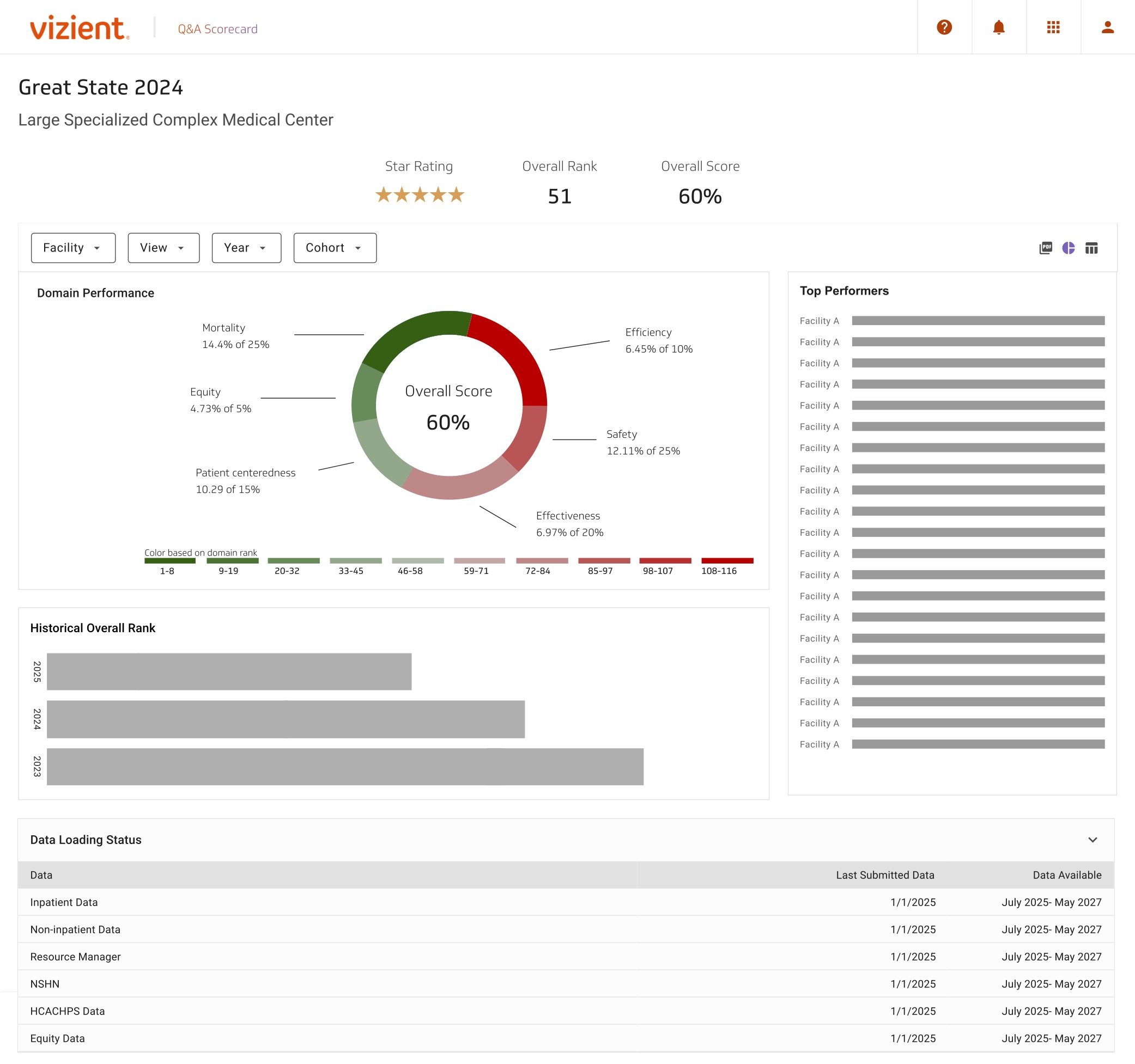
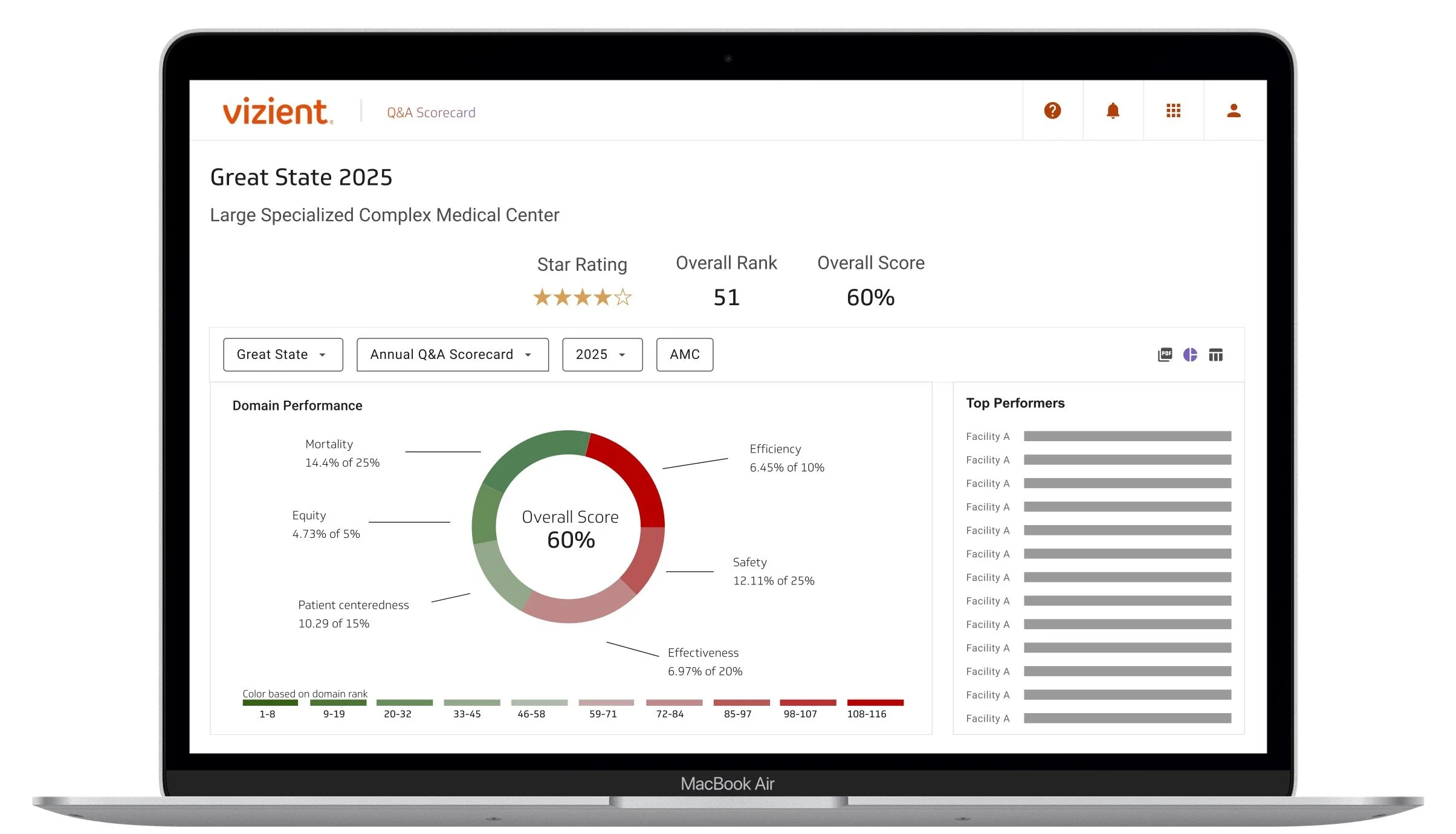
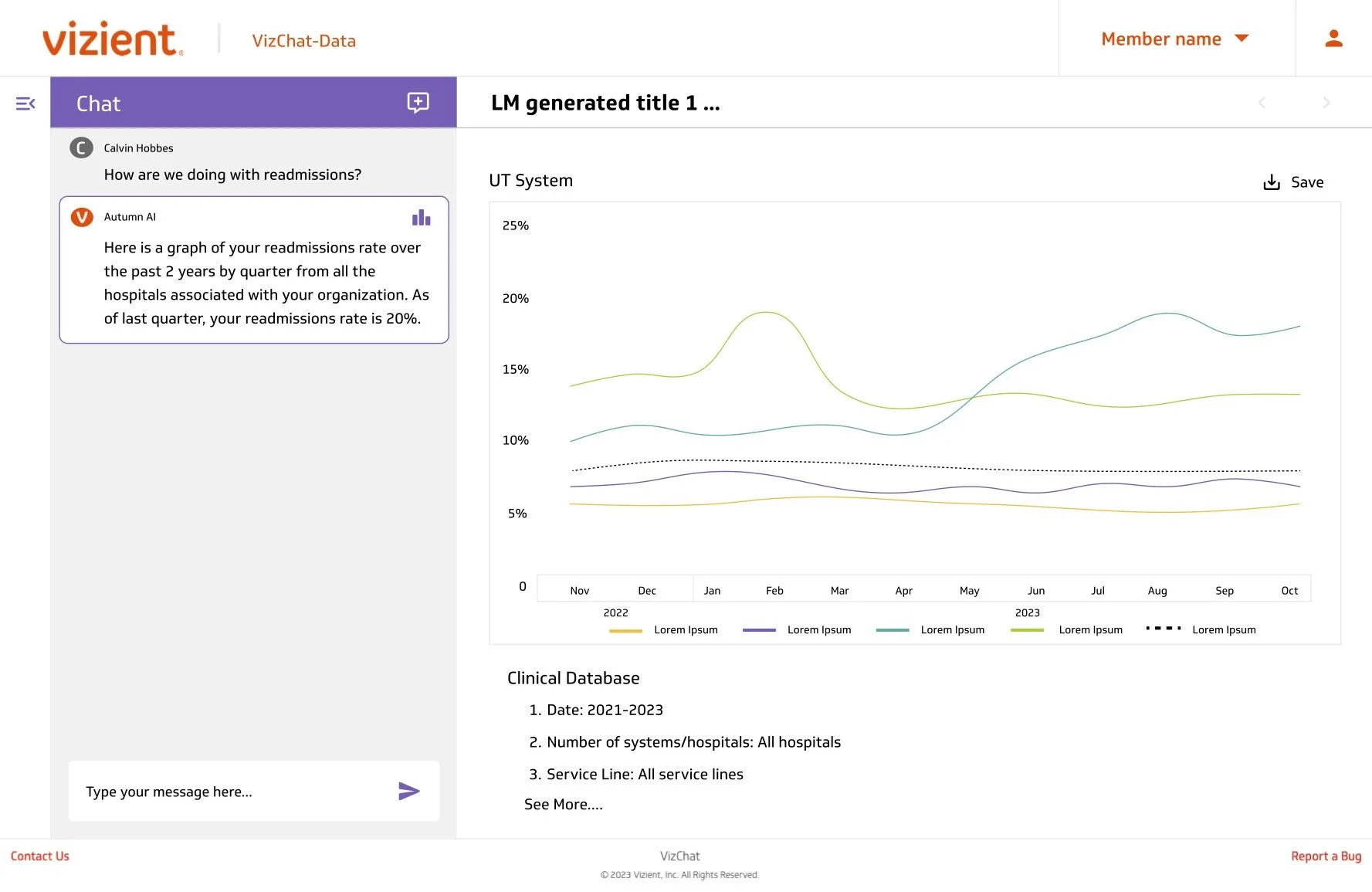
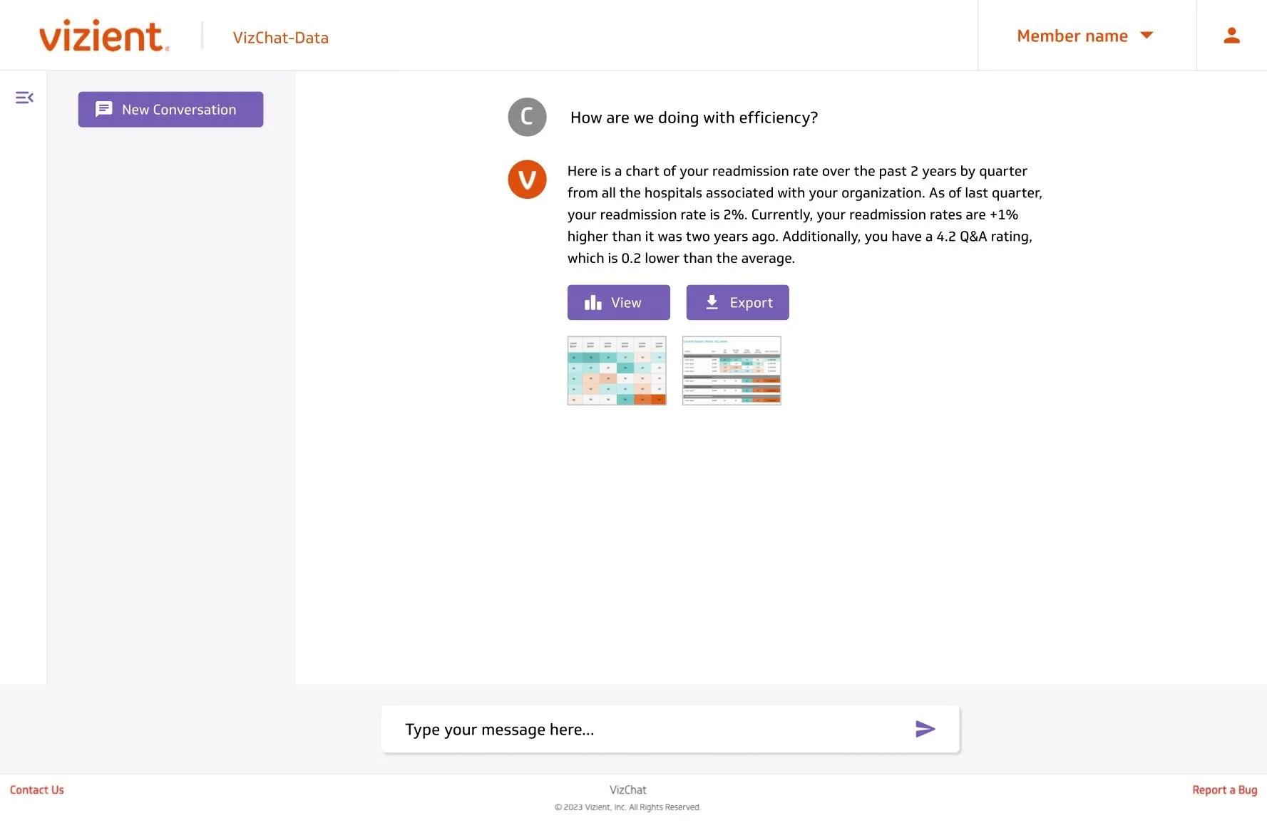
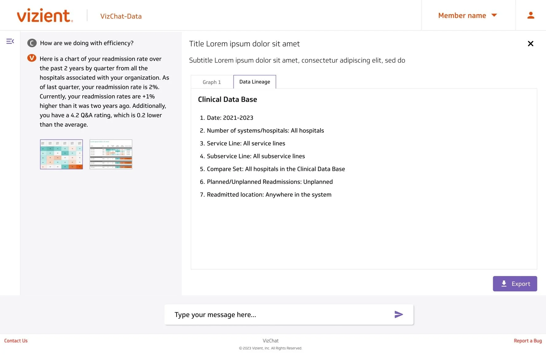
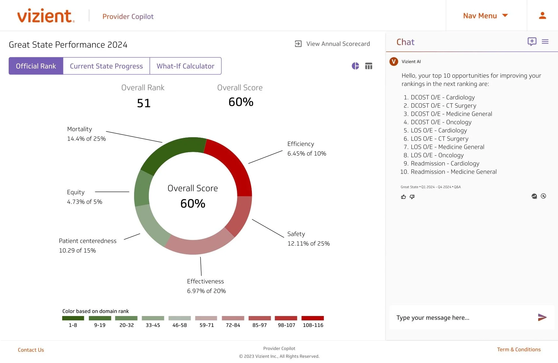
Users start on this page to get a snapshot of their organization's performance. It's commonly used to share insights with executives.
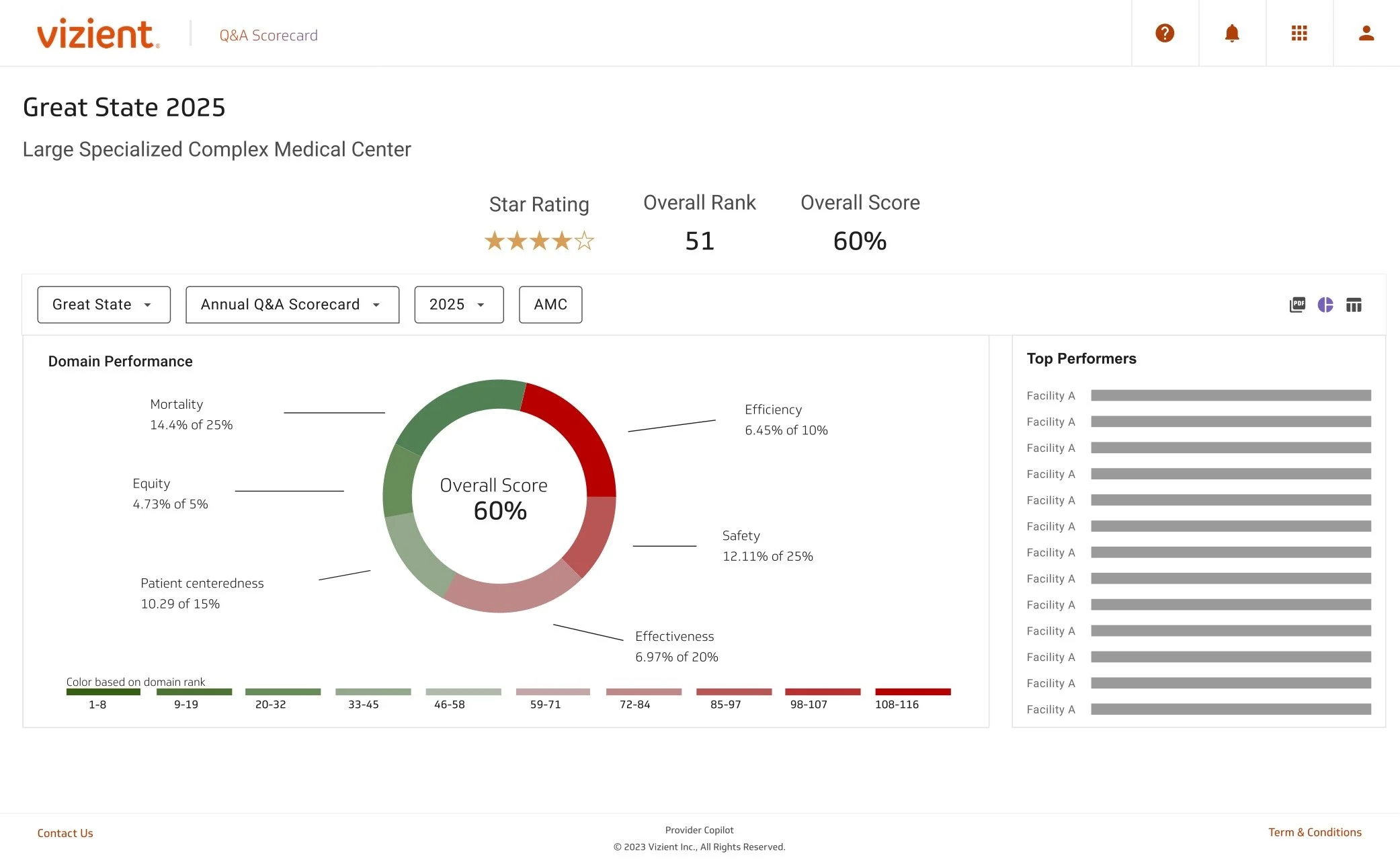
This provides a more detailed breakdown of their domain performance.
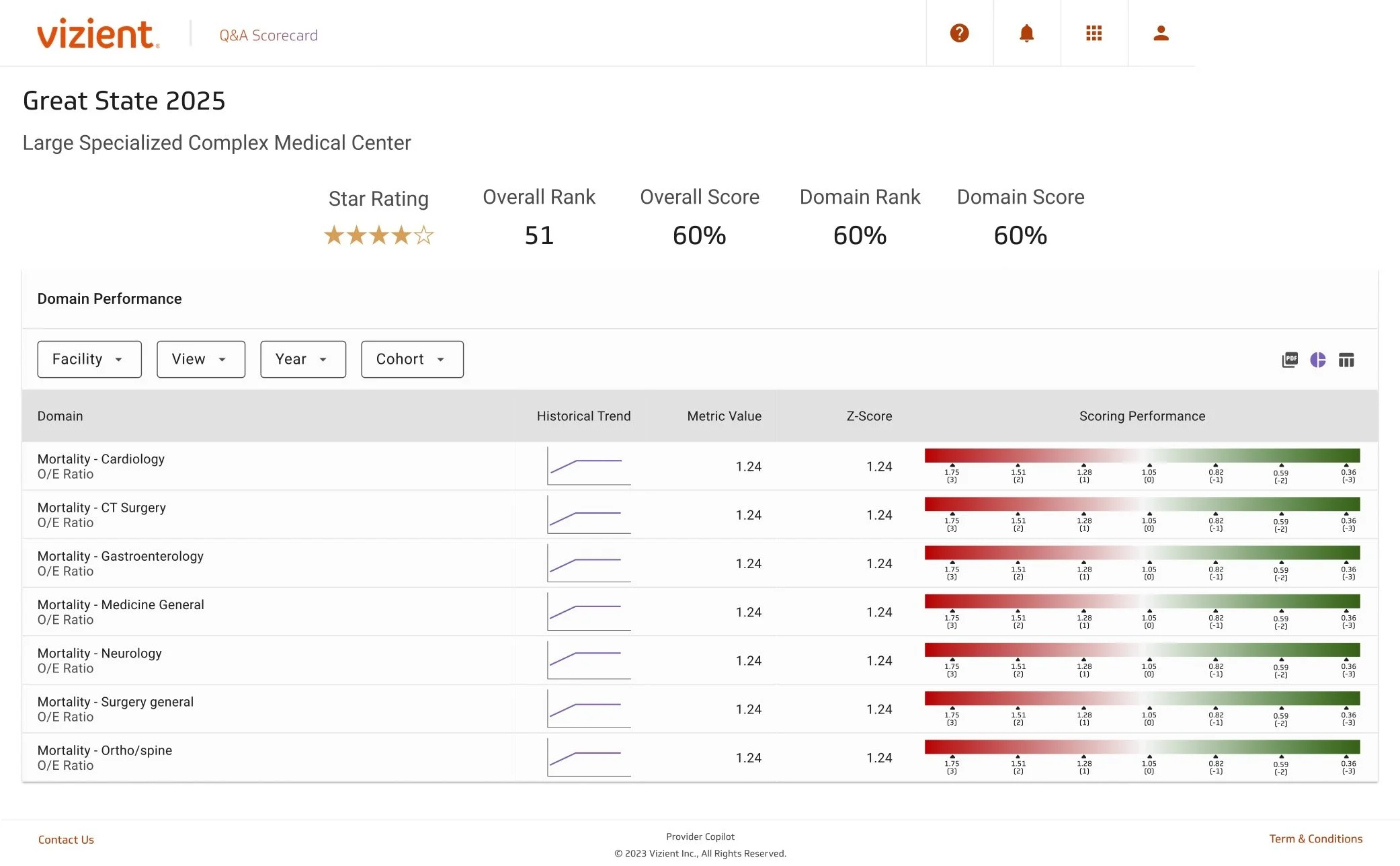
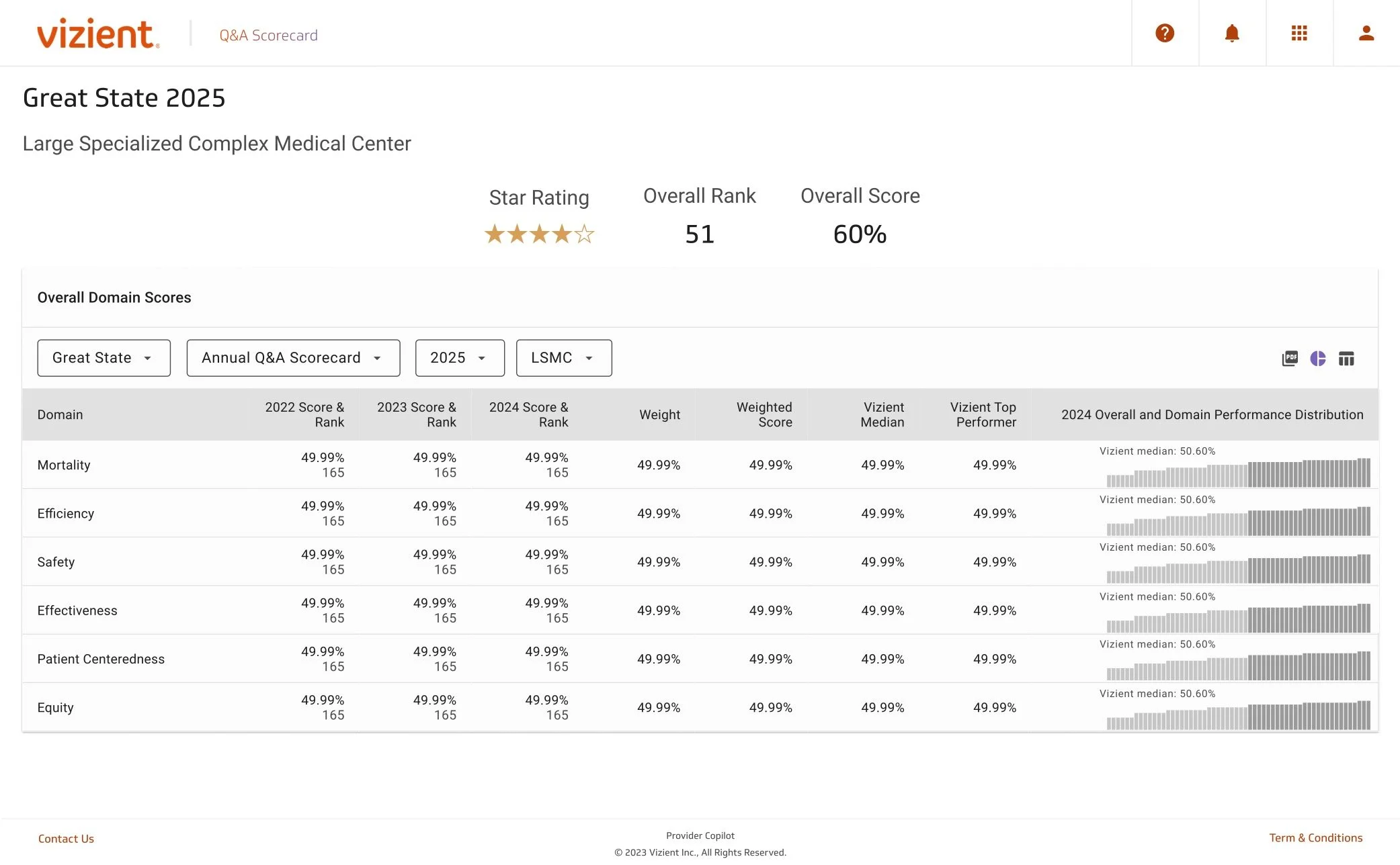
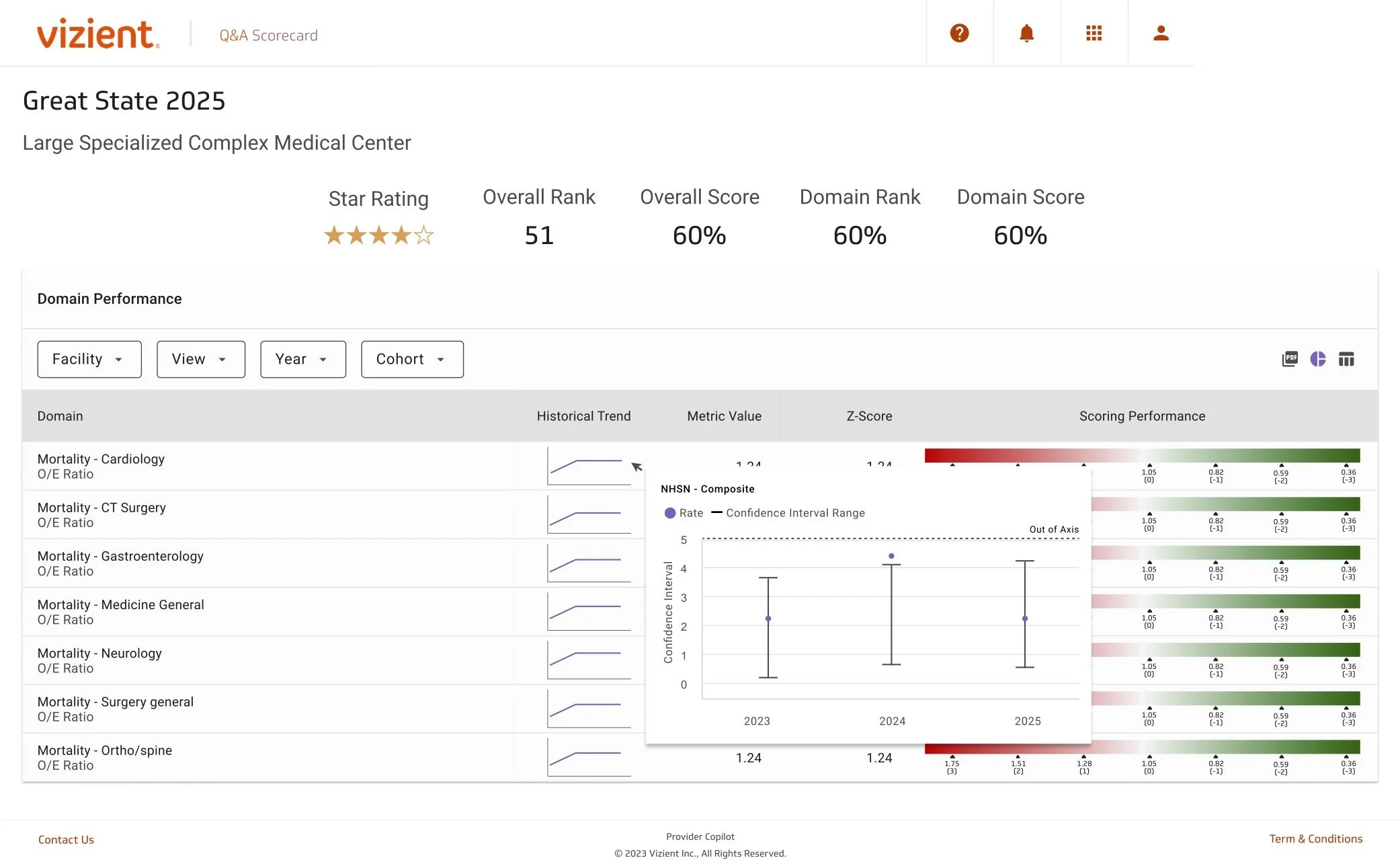
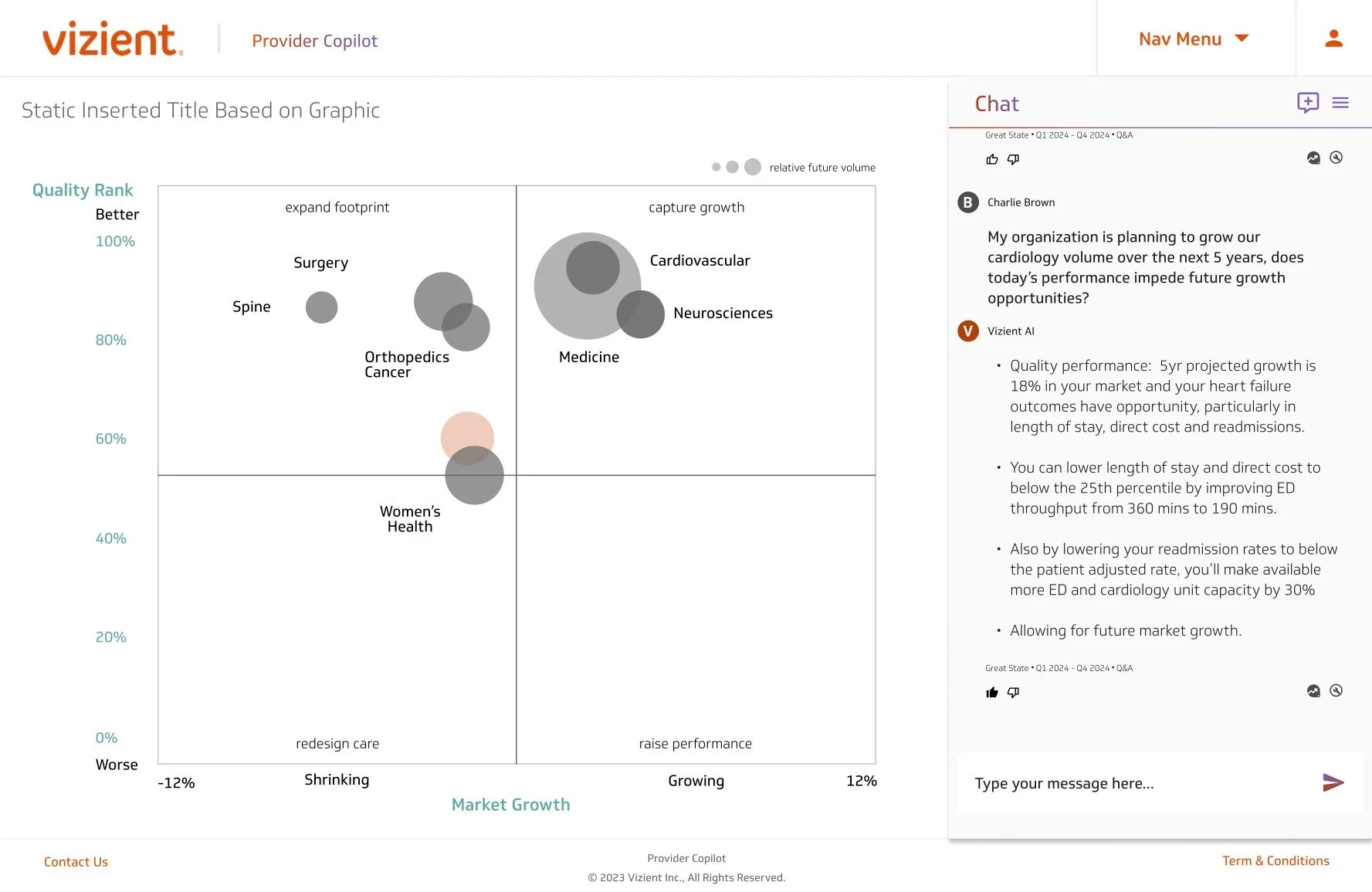
Users can explore their organization's performance by domain and dril into specific areas.
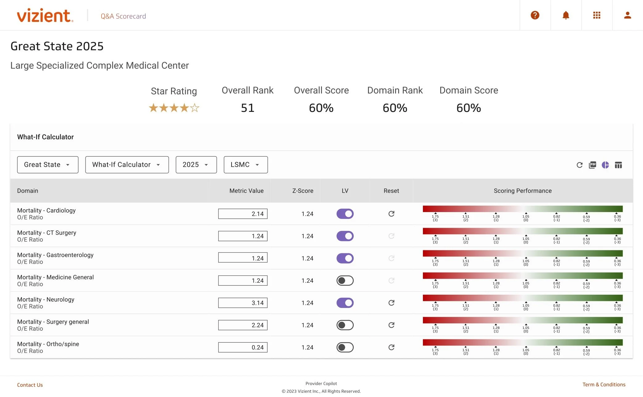
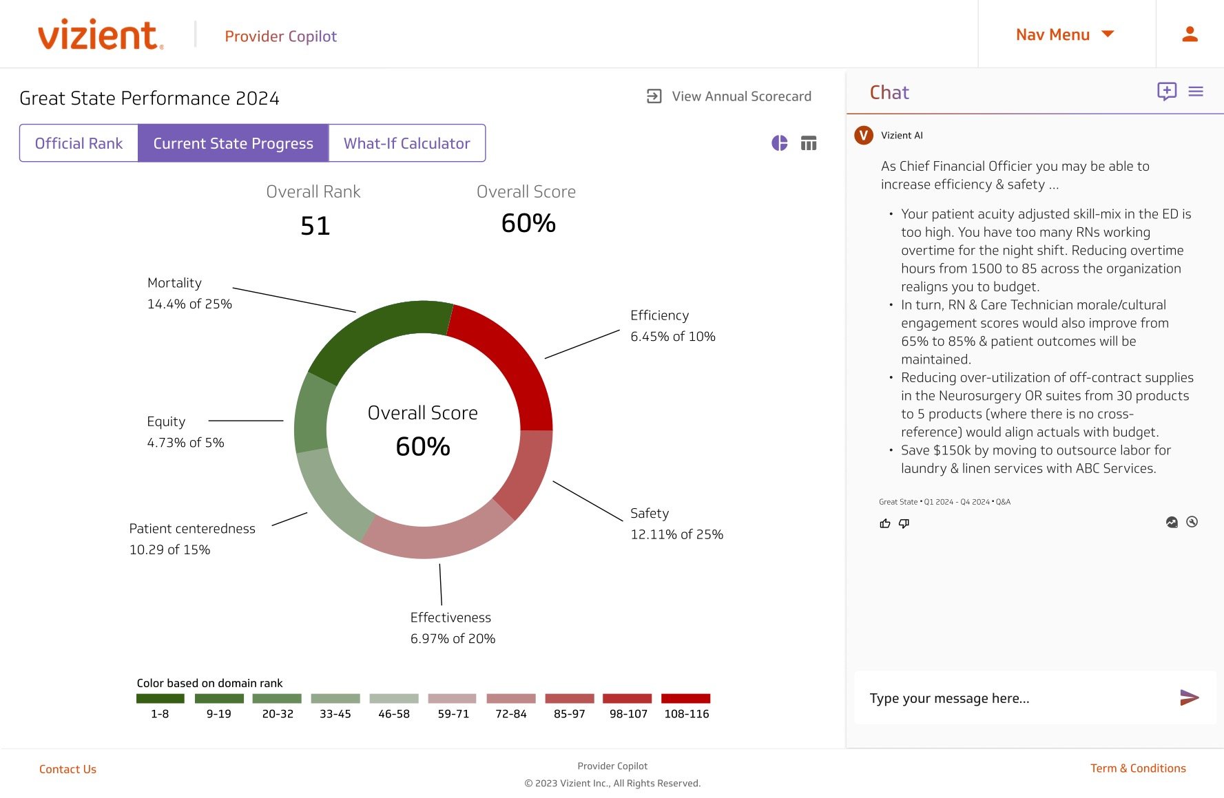
Users can use this page to create projections, making it one of the most popular features.
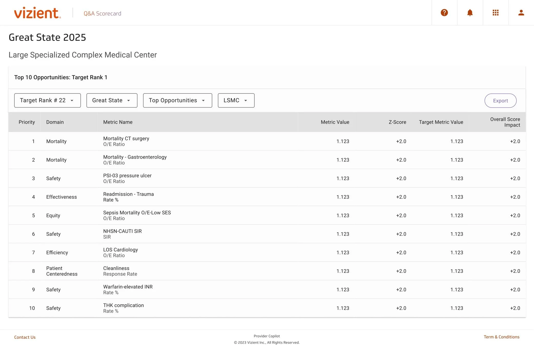
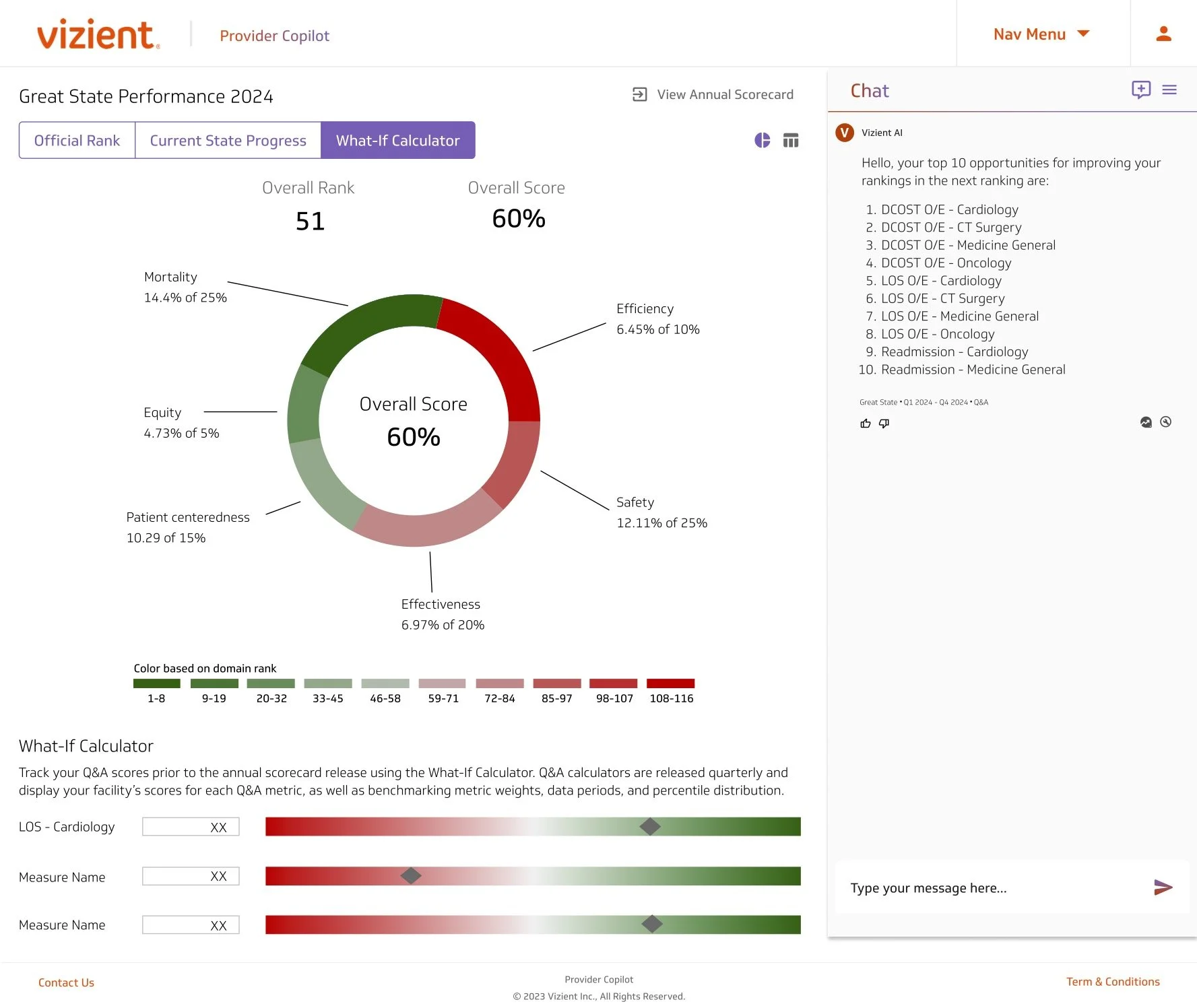
This page highlights the specific domains and metrics where an organization can improve.
Take-Aways
This project required navigating significant organizational challenges.
Cross-Team Coordination
Managing alignment across multiple engineering teams and PMs with shared goals and tight deadlines.
Design Continuity Through Change
Maintaining vision and consistency through leadership transitions by thoroughly documenting decisions.
Strategic Balancing
Prioritizing achievable near-term solutions while mapping ambitious future-state features.
Learning from Failure
Recognizing when technology (conversational AI) wasn’t ready and advocating for its removal rather than compromising user trust.
These challenges strengthened my skills in cross-team collaboration, design leadership and through uncertainity, and strategic thinking that balances ambition with reality.