aptitude Homepage Redesign
Simplifying navigation and clarifying hierarchy for better usability

Project Overview
The company’s website had not been updated for nearly 10 years. Users were forced to pass through it daily to access the platform, but it provided no value.
I led the redesign to transform this overlooked entry point into a strategic hub that surfaces delevant data, highlights actionable opportunities, and helps users make informed decisions the moment they log in.
Responsibilities
UX and UI Design
Research & Testing
Prototyping
Present to key stakeholders
Gather requirements from key stakeholders
Collaborating with PM’s & Developers to build page
Tools
Figma
Jira
Storybook
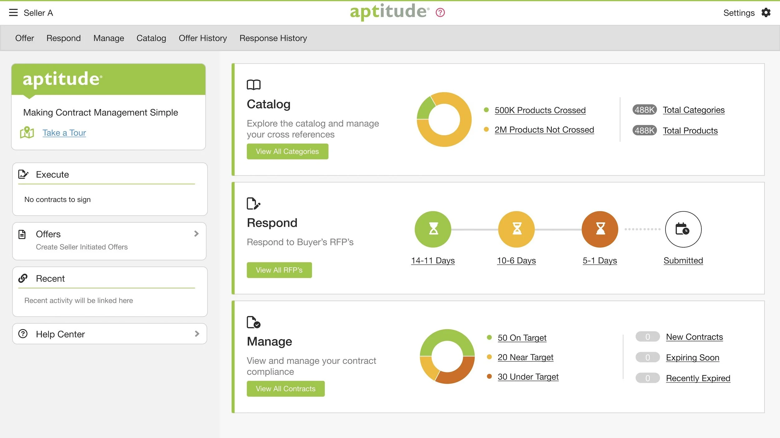
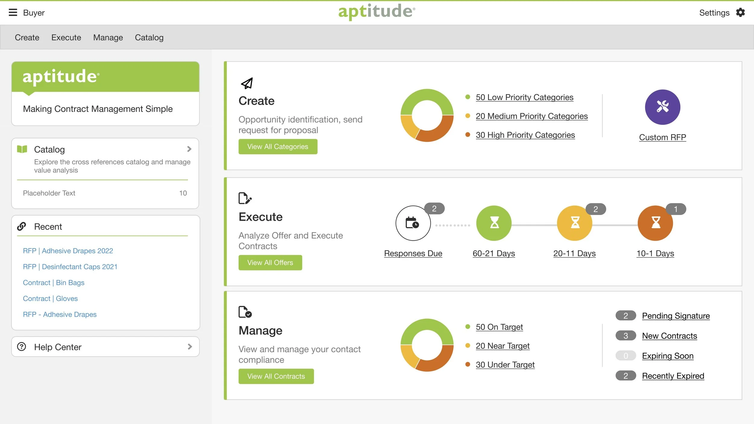
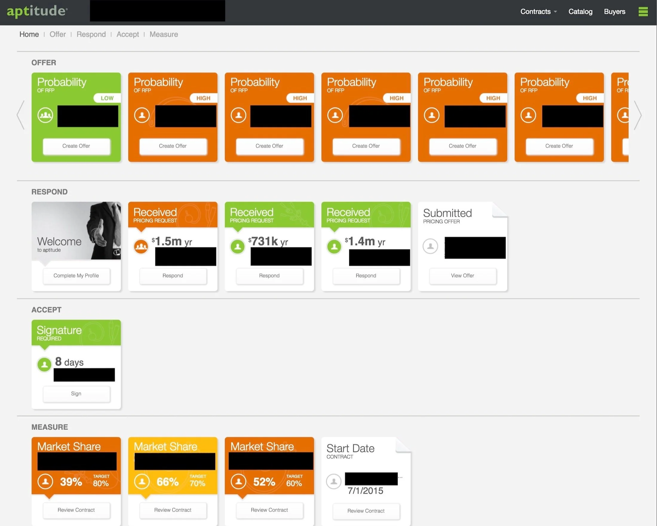
The Problem
Hospital supply chain managers and teams use the aptitude platform to manage complex contracts worth millions of dollars. The homepage was their mandatory entry point, yet it offered nothing useful.
Pain Points:
No visibility into contract status or performance at a glance
Missing quick access to time-sensitive actions
Outdated interface
Goal:
Design a modern, user-centered homepage that provides immediate value - surfacing relevant data, actionable opportunities, and streamlined access to key workflows.
Discovery & Research
As a new designer at the company, I first needed to understand the complex healthcare supply chain domain. I worked closely with key stakeholders - including product managers and directors - to understand the user needs and business requirements.
Stakeholder Insights:
Through collaborative sessions with stakeholders who had direct customer relationships, I learned users needed
Quick access to active contracts and recent activity
High-level performance summaries and alerts
Clear navigations and orientation
Competitive Research
I researched modern B@B Saas platforms to understand emerging patterns in dashboard designs, particularly how they balanced data density with clarity and provided role-based personalization.
Design Process
Three - Day Design Sprint
I participated in a focused design sprint with the product team and key stakeholders to define the problem, concept sketches and collaborative ideas and make high-fidelity
mock-ups to present to the stakeholders.
My Approach:
Clarity over density - surface the most important information
Actionable Insights that are clear and not overwhelming
The team created several distinct design directions exploring information hierarchy and layout. We each presented our idea to the stakeholder committee.
Design Selection
My design was selected as the foundation for the new homepage because it:
Provided clear visual hierarchy that guided users naturally
Balanced data density
Maintained brand consistency while feeling fresh and modern

Design Challenges & Solutions
Challenge 1: Strict Brand Color Constraints
The platform uses a color-coded system where specific colors are reserved for specific contract catories. This severly limied our design palette. Additionally, using white text on these brand colors is not ADA compliant.
Solution:
I used color strategically in icons and data visualizations ensuring that text was never white and placed on a color. This required careful design decisions to maintain visual hierarchy and bran consistency.
Challenge 2: Complex Domain & Steep Learning Curve
As a brand new designer at the company, I had to quickly learn an extremely complex domain. Healthcare supply chain management involves understanding RFP processes, contract structures, compliance requirements, and procurement workflows—all with significant legal and financial implications. The data displayed on the homepage needed to be both meaningful and accurate for users managing multi-million dollar contracts.
Solution:
I worked closely with a key stakeholder and asked detailed questions about user workflows and pain points, and studied the existing platform to understand data relationships. This deep domain learning allowed me to design a homepage that didn't just look good, but actually served the complex needs of supply chain professionals.
Challenges 3: Information Hierarchy
Stakeholders had priorities about what information should be most prominent.
Solution:
I worked with stakeholders to identify core elements while advocating for visual appeal and modern design patterns.
Results & Impact
Launch & Adoption
The new homepage launched to over 1,000 hospital providers and was universally praised as user friendly and useful.
One Year Post Launch user feedback:
“We have users that sign on everyday, one a week or only when they need to work on a category. The navigation of the new homepage, the look and feel is very much appreciated from the market. It’s really helping those users who aren’t ‘super user's’.”
“It is simple to find what you need!”
“I can easily identify opportunities and execute and manage my contracts and track my compliance and performance.”
Key Takeaways
Domain Complexity Requires Deep Understanding
Designing for healthcare supply chain required learning RFP processes, contract structures, legal constraints, and stakeholder priorities. This domain expertise was essential to creating a genuinely useful solution rather than just a visual refresh.
Accessibility Within Constraints
Working within strict brand guidelines and color systems taught me to be creative with accessibility solutions—using contrast, size, spacing, and interaction patterns rather than relying solely on color.
Stakeholder Buy-In Through Collaboration
Involving key stakeholders in the design sprint ensured the winning design had broad support and made implementation smoother. The collaborative process was as valuable as the final design.
Small Changes, Big Impact
Sometimes the most overlooked pages (like a mandatory login landing page) offer the biggest opportunities for impact when redesigned with user needs in mind.